
Saturday, 2 April 2011


Wednesday, 30 March 2011
Tuesday, 29 March 2011

Monday, 28 March 2011
Sunday, 27 March 2011
Thursday, 24 March 2011


Wednesday, 23 March 2011
Final draft of contents page


Tuesday, 22 March 2011
Final draft of cover

To improve my front cover I added extra sell lines as there was not enough to attract readers.

Monday, 21 March 2011
Friday, 18 March 2011
Wednesday, 16 March 2011
Tuesday, 15 March 2011
Saturday, 12 March 2011
Tuesday, 8 March 2011
Props and poses
Check out this SlideShare Presentation:
Props and poses
View more presentations from 123sabiha.
Thursday, 24 February 2011
Front cover designs


Above are a few designs on how i am planning on designing my front cover. Looking at many different types of music magazines i had come up these ideas, as they appeal to the readers, and are easily seen to be a music magazine, rather then an entertainment or fashion magazine. The layout of the magazine is straight forward as it has a title, sell lines, bar code, image of an artist, easily shown as a music magazine.
Wednesday, 23 February 2011
Contents page designs


The above are designs of type of contents page i will be creating. I added things such as editor review an image of the cover with detail about it. Images of other artists and page number above them so it is easy for the reader to find them. As as all these conventions are typical music magazine conventions.
Tuesday, 22 February 2011
Double page designs


These are ideas for my double page spread, in both designs i used an image of an artist as well as other features within the magazine, which many double page spread articles tend to have, as well as a bold heading. The article or image tend to have the most space as they are the most important factor. Following these designs would allow me to create a typical music magazine, as looking at many different types of music magazines i have got these ideas.
Monday, 21 February 2011
Different font styles for title
Below are many different styles of font which i have thought of for the title "Rhythm" which will be the the title of my magazine. The font which would appeal more to the genre that i have chosen would be 11, as it is bold as well having style to it, which will attract attention to the magazine.
1) Rhythm
2) Rhythm
3) Rhythm
4) Rhythm
5) Rhythm
6) Rhythm
7) Rhythm
8) Rhythm
9) Rhythm
10) Rhythm
11) Rhythm
Sunday, 20 February 2011
Interviews
So that i am able to know what people would like to see on the front cover, contest page and the double spread article, i asked several question so i was able to gain the information which would help me design my magazine. The following are the questions that i had asked as it might not be clear in the audio:
1) Would Hip Hop or Pop be a good genre to base my music magazine on?
2) What do you think of the following titles, which one will be the best one for my magazine?
Hip the hop
HHP
Rhythm
3) Should my main article be based on an interview?
4) Do you think i should base my article on a solo artist or a band?
5)Do you think my contents page should have a wide range of image as well as text?
6) Should i have freebies within my magazine?
Saturday, 19 February 2011
Graph 5- Spend

To know how much I should sell my magazine for, I asked the question “how much are you willing to spend on magazine?” From the graph it is clear that the majority who took part in the questionnaire prefer paying £2 for magazine. Most people are not willing to pay no more then £3. From the results I can see that it would be best to base the price of my music magazine around £2-£3. More people would prefer this price, so it would be better.
Graph 4- Features

What features do you prefer in a magazine, was a another question i had asked, from this question i am able to see that most people prefer have interviews in a magazine, getting information about the artist from the artist. From this question i am able to see that if i base my double page spread on an interview ill attract more readers. The second highest was gossip, having some gossip within it would also be a good idea. Interviews would be a good idea as it also aimed at the ages range of 17-20.
Graph 3- Age

Another question that I had asked was relating to age. From the graph it is clear that the majority of people who had answered these questions were in the age range of 17-18. From this it is clear that when designing my music magazine I should aim to focus it on between the ages of 17-20, despite the majority who answered the questions were 17-18. Having a wider age range would attract more readers.
Graph 2- Genre
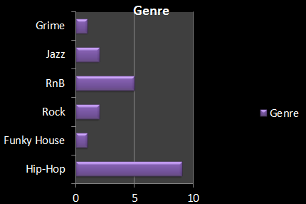
The following table shows the Genre of music, and which was the most popular genre. Shown from the graph above the most popular genre would be Hip-Hop, as it would appeal to my target audience. As the questionnaire is was asked to a younger audience. The second most popular genre is RnB which might also be a part of my magazine, as having this will attract a larger audience.
Graph 1- Gender

As part of my research I had to ask a variety of a question one of them being gender. From the results it is shown that the majority of people who took part in the questionnaire where females, 14 female took part in the questionnaire and 6 males. From the results it shows that despite having a larger amount of females audience there is yet a large amount of males, showing that my magazine should focus on both male and female.
Friday, 18 February 2011
Questionnaire Results
The following are the results from the questionnaire. 20 people were asked. To be able to get a wider view on what sort of music magazine i should create i asked both male and female as it will allow me to have a wide range of readers.
1) How old are you?
15-16- 3
17-18-14
19-20-3
2) What Gender are you?
Male-6
Female-14
3) What Genre of music do you listen to?
HipHop-10
Funky house-0
Rock-2
Jazz-1
Grime-0
RnB-7
4) Who is your favourite artist or band?
Nicki Minaj-1
Drake-1
Akon-2
Bruno Mars-3
Nelly-1
Eminem-2
Lil Wayne-1
Rihanna-1
Peter Andre-1
The script-1
Beyonce-2
Justin Bieber-1
Michael Buble-1
Cheryl Cole- -1
Tinnie Tempa-1
5) What are your hobbies?
Singing-2
Playing games-0
Dancing-1
Sports-7
Shopping-8
Reading-2
6)What features do you prefer in a magazine?
Gossip-5
Fashion-2
Latest celeb rumors-4
Adverts-2
Interviews-5
Events-2
7) What freebies would you like within a magazine?
CD's - 4
T-shirts - 2
Ipod cases - 1
posters - 5
Headphones - 2
Vouchers foor itunes -5
Other- 1
8) How much are you willing to spend on a magazine?
£1-2
£2-12
£3-5
£4-1
9) What Music channels do you prefer?
MTV- 7
Kiss- 4
Box-2
Vivi-2
4muisc- 5
other-0
10) What sort of magazine do you usually buy?
Fashion Based- 9
Music Based- 5
Entertainment Based- 6
11) Do you ever attended concerts?
Yes-3
No- 12
Rarely- 2
Occasionally- 2
Frequently-1
Tuesday, 15 February 2011
Questionnaire
For my media coursework, I will be creating a music magazine, which will be aimed at a certain audience, to be able to know what sort of magazine I should produce; I will need to do some research, to know what readers are looking for in a music magazine. I would be grateful f you would answer the following questions.
Please circle the applicable boxes to you.
1) How old are you?
15-16
17-18
19-20
2) What gender are you?
Male
Female
3) What genre of music do you listen to?
Hip-Hop RnB
Funky house Jazz
Rock Grime
4) Who is your favorite artist or band?
_____________________________________________________________
5) What are your hobbies?
Singing Playing games
Dancing Sports
Shopping Reading
6) What features do you prefer in a magazine?
Gossip Interviews
Fashion Latest celeb rumors
Events Adverts
Other_________________
CD’s Posters
T-Shirts headphones
Ipod cases Vouchers for Itunes
Other ______________
8) How much are you willing to spend on a magazine?
Up to:
£1 £2
£3 £4
9) What music channels do you prefer to watch?
MTV VIVA
KISS 4Musicc
Box Other_________
10) What sort of magazine do you prefer?
Fashion based
Music Based
Entertainment based
11) Do you ever attend concerts?
Yes No
Rarely Occasionally
Frequently
Reason for questionnaire- I created a questionnaire to help me design my music magazine, from my questionnaire i will be able to tell what sort of things people prefer within a music magazine, as well as this the questionnaire will also allow me base my magazine on a specific audience as well as genre. Getting the opinion of different people will allow my magazine to attract a larger amount of audience, as the majority will prefer the style of magazine produced at the end. Through this questionnaire i will gain both subjective and objective data. Answers that will be provided from the questions will give me knowledge on how it should be created.
Tuesday, 1 February 2011
Double page spread analysis 2

This article is from the music magazine kerrang, which is based on indie/rock music. As soon as the reader looks at this article the fist thing that they would see would be the quote by the singer the article is based in Lilly Allen. Having bold quotes within a double page article is a typical convention of music magazines.
Lilly Allen's image on the right takes up the whole of the right side, The artist has direct contact with the reader which is also another convention within music magazines, having direct contact allows the audience to be directly drawn into the article. Through mise-en-scene we can see that the artist is not representing a typical female, as she is not wearing female type clothing and is more towards the masculine side, as shown from the color of the clothing as well, as it is red. Subverting the representation of a typical female.
The article starts of with a Bold quote, which is written in white, and large font compared to the other font, and has a black background to it. Appealing to the audience. The colors used within this article are red, black and white, these colors are not bright colors, but as they are used on a white background they attract more attention. These colors go well together because they allow the magazine to be more understandable from the readers. the main point are stated in red, as the artist is wearing red it also shows that she is the main point of the article.
Before the article starts there is a few lines, describing what the article is about, this is useful as it allows the reader to either read on or not, as they don't have to read the whole article, the intention of the few lines are for a reader who will either read on or who will not. The article it self is very neat, organised in paragraphs, with the same font through out, making it easier for the reader.
Double page spread analysis

The double page spread from NME magazine, and in this double page article it is featuring "The Teenagers". The title of the article allows the reader to understand who the article is based on straight away as it gives the bands name.
Also there is a very bold image of the band, which easily gives it away as well. The image on the left takes up a whole section. The image of the band attracts the readers sight straight away has the band have direct contact with reader. The shot of the band is a high angle shot, giving the audience full shot of them. Through the relaxed mood, it shows that this article is mainly aimed towards teenagers, as shown through there clothing, as they are dressed casually, and the idea of a bed shows typical teenage behavior as they are known to be lazy. From the images on the wall it is seen to be appealing to young teenage boys as there is posters on the wall, attracting boys.
Within the corner of the image there is a box which is bold and blue, as seen the important information of the article are bold and in surrounded by blue background, as "RADER" "Need to know" and the title are stated in a blue box with black writing and is bold attracting the readers eye straight away. The style of certain points on the magazine relate to teenagers such as the "need to know" box its a notepad style showing its meant to attract teenage readers. The style of font used within the article is simple, targeting its target audience. There is a also a quote from the band, which is also a main attraction of the magazine as shown by the blue background. The quote mentioned by the band, also relates to teenagers. At the bottom of the page, within the middle there is also some information on the magazine and the web address, this stands out as it is red and there is only that section that is is red, this box allows if they wish to gain more information about the magazine and other articles.
On the right hand side of the page there is the article about the band and also "Everyone's talking about" Having to types of ideas on one side, attracting many different readers, wanting the readers to read on through the rest of the magazine. As the other part of the right has information about other bands. Having images on some bands, makes it easier for the readers, allowing th magazine to look more professional, not is is this what makes it look more professional the limited amount of colors also allows the magazine to look more professional, colors used are black, blue and white.
Monday, 31 January 2011
Analysis contents page 2

The colours within the contents page are not too bright, yet attract the audience, due to it not being so busy. The layout of the contents page is straight forward as well, having placed the images on one side and text on the other. Despite the image, there is some extra information about a band, below features, “oasis special” Which is not as bright as the other headings, so less attention is drawn to it, and more attention drawn to other factors, but due to it having a large amount of space on the band, it shows what the main article will be within the magazine.
The numbers of each pages stand out as they are big and in a bright colour, the subheadings are also bold, and underneath them there is a sneak peek of what is within a specific article, allowing this to draw the readers into buying it. Due the subheading having a bright red background within them, it makes it easier for the consumer to find what they are looking for if it is “features or every month”, showing it holds many different types of information within the magazine.
The contents page is very useful, in many ways, not only because it give extra information about the article, due to the review at the bottom right, which makes it easier for the person who read the magazine to access what they would like to get from the magazine. Having clear information held within it. This contents page doesn’t only attract attention to a specific thing the attention is drawn through out the page, due there being bold headings and images, as well extra boxes giving extras to the consumers.
Some of the stories, below the sub headings allow the readers to know what the magazine will hold within it, the contents allow the audience to easily skip to what they would like to read rather then going through the whole magazine as a lot of contents pages give a limited amount of information on the contents page. This also allows the magazine look more professional, as there is a straight forward layout.
Sunday, 30 January 2011
Analysis contents page 1
The above contents page is from music magazine Kerrang, the contents page seems to be a very busy page, eye catching, with a lot of images, making it easier for the audience to understand the subheadings by relating to the images. It’s a very explanatory page, due to the amount written as well images. Through the images it is also easy for the audience to understand what sort of music is represented in this magazine which is rock.
The subheadings of the contents page are clear and bold, allowing the consumer to easily recognize the numbers of pages and what they are base on. The colour of the sub headings are black and yellow, allowing it to me more eye catching. The images being on one side and the text being on the other show the simplicity of the contents page. The page numbers are also clearly indicated beside set information, which are also bold, making it easier for the reader to find certain features.
For a magazine representing rock there is not much stereotypical rock represented within it, showing that it can lose its audience, due to there being many bold images, there is not much attention given to the text, which indicate what features are held within the magazine. Whereas as the images is able to lose audience. The images give less information to the consumer.
The contents page is very useful within the magazine due to it having extra information about the editor as well as using images to indicate on certain artist, attracting different types of audiences. Despite it being a bright a page there is yet a limited amount of colour being used thought out the contents page, keeping it a bit simple and understandable for the readers.
There is also some extra information about the magazine, on the top left hand corner the editorial, which allows the readers to get a better insight on the design of the magazine and other information about the magazine, the style of writing used in the editorial relates to the target audience, allowing the audience have a better view of the magazine.
There is also some extra information about the magazine, on the top left hand corner the editorial, which allows the readers to get a better insight on the design of the magazine and other information about the magazine, the style of writing used in the editorial relates to the target audience, allowing the audience have a better view of the magazine.
Analysis cover 3

Blender magazine magazine which focuses on a variety of genres, in this cover it is representing pop as well as hip hop as it shows on the front cover, “POP’S BI-CURIOUS BABE” The magazine name is the most effective view upon the front cover due to it being very bold.
Once again this cover suggests simplicity, through the calm white background, as well as the sub headings not being so bold and effective. Pink is a stereotypical colour for girls showing that the audience of this cover is mainly females, around the age of 16-25. From the heading "free downloads!" it also shows that the audience they are trying to attract are younger audiences, as the younger generation tend to consume music through downloads.
There is a limited amount of colors used, black, pink and white. Having a limited amount of colors has a better effect upon the readers as well as the magazine, due to it looking more professional, as well as it being clear for the readers.
There is a limited amount of colors used, black, pink and white. Having a limited amount of colors has a better effect upon the readers as well as the magazine, due to it looking more professional, as well as it being clear for the readers.
Due to the lack of colours the cover yet has a lot of attention drawn towards it due to the emphasis of the heading through capital letters. Attracting its audience, and easily getting a glance of what the magazine holds.
The main image on the front cover is of Katy Perry, pop icon. Through mise-en-scene we can see that the way in which Katy Perry is dressed is how pop icons as well as hip hop, tend to dress. From the clothing it also may attract male, as the way she is dressed is reveling attracting male readers wanting to read on, due to her look. From the cover we are also able to see the different topics involved within the magazine as well various artists such as T-Pain and there view upon things, allowing this to be way in which Blender is able to attract there consumers. The cover also shows that it has various different songs within the magazine which consumers may enjoy, gaining more audiences.
The cover of this music magazine is very simple despite it having a limited amount of information about the inside of the magazine, it is yet very bold and eye catching, due the main image of Katy Perry having direct eye contact with the audience. The scheme of using less colours works well as well, it having less happening on the cover allows the audience to understand what will be held within the magazine in more clear view.
Analysis cover 2

Hip-hop collection is a hip-hop magazine. Attracting both male and female audiences between the ages of 15-25. The heading of the magazine is very eye catching, due to its colour as well as the size of the font, all the subheadings on the front cover, are bright, allowing it to be eye catching attracting the audience straight away. Having a limited amount of colors is a benefit as it shows neatness and attracts audience.
The main picture on the cover is an Image of Jay-Z, the image of him is suggesting a serious feeling, as well as wealth as the artist is wearing a ring and chain which is shown as a stereotypical view of an hip-hop artists, the image has direct contact with the audience, which is a typical feature in music magazines. Due to the seriousness, it is showing the sort of audience that the magazine is trying to gain. The idea of the artist wearing a cap is also a typical convention within hip hop magazines.
The main picture on the cover is an Image of Jay-Z, the image of him is suggesting a serious feeling, as well as wealth as the artist is wearing a ring and chain which is shown as a stereotypical view of an hip-hop artists, the image has direct contact with the audience, which is a typical feature in music magazines. Due to the seriousness, it is showing the sort of audience that the magazine is trying to gain. The idea of the artist wearing a cap is also a typical convention within hip hop magazines.
Sub headings also show that the magazine about Jay-Z as it says “Jay-Z HE’S BACK!” Showing that it may be an interview of him.
The main offer to the readers is a free CD, the magazine also holds a free CD within it, which is shown from the front cover, as the audience within the age category prefer such freebies."Free CD" written in the top left corner as it based upon a white background, quickly catching the readers attention, as well having extra information about other artist. "50 NEW YORK ANTHEMS!", is also another feature in the magazine which is bold and stands out, just the way the free CD does. Having this feature also shows that it will attract readers who prefer the type of music.
The front cover does not subvert typical conventions, as it is straight forward and connoting what it should be. The cover allows us to see who the audience are, and how it attracts its audience, through the image which is portrayed by the artist on the cover, as well the bright colors use. Conventions used in this cover would be the idea having the artist in front of the title, which is a very popular convention in music magazines, as well as a bar code, as previously mentioned the ring,chain and cap worn by the artist all are typical conventions of a hip hop magazine.
The front cover does not subvert typical conventions, as it is straight forward and connoting what it should be. The cover allows us to see who the audience are, and how it attracts its audience, through the image which is portrayed by the artist on the cover, as well the bright colors use. Conventions used in this cover would be the idea having the artist in front of the title, which is a very popular convention in music magazines, as well as a bar code, as previously mentioned the ring,chain and cap worn by the artist all are typical conventions of a hip hop magazine.
Analysis cover 1

From the front cover of the magazine you can see that the target audience for this magazine would attract both males and females around the age of 16-25. The first thing that attracts the readers eyes as they see the cover would be the medium shot of the artist Taylor swift an pop artist also knows as an hip hop artist, she has direct contact with the readers, engaging the audience. The title is placed behind the artist which is a typical convention within many music magazines, allowing audiences to focus on only the artist. The artist is dressed simply, following the the color scheme of the cover. As well as having a limited amount of jewelery, conveying simplicity as the cover is simple and straight forward, there is not much going on within the cover as shown from the artist as well as colors.
There is a moderate amount of sell lines showing who it is targeting such as “boyfriend trashing radio ruling” yet showing a clear understanding of what the has within it, as well as showing that is aimed towards teenagers. Despite some appealing to females, there is some that appeal to both such as "194 Downloads" this tends to relate to a younger audience as they tend to consume there music through downloads. Through some sell lines it shows that the magazine is not only aimed at younger readers as well as those who are into Hip hop. "Plus Cnarls Barkly, Nirvana, Michael Jackson" From Nirvana we can see that it can also attract older readers as well as younger ones as shown from the image of Taylor swift, who appeals more to younger readers. From the many different types of artist mentioned in the mentioned in the magazine we can that the Blender magazine is representing a wide range of genres such as pop, hip hop, rock and and RnB.
The layout of the front cover is simple with no much color within it, colors that are used are blue black and grey which tend to be seen as dull colors ,despite this the colors do stand out, font is also very limited, having less going on allows the readers to understand it.
The black box adds an extra image to the cover, which is more appealing, and allows some of the main features to stand out, the color of the box attracts audiences attention straight away as there is not many such conventions on the magazine.There is many typical conventions on the magazine such as bar code, mass heads also colloquialism "D'OH!"
Blender magazine was previously published by Dennis publishing, but now is published by Alpha productions.
Wednesday, 26 January 2011


Subscribe to:
Comments (Atom)