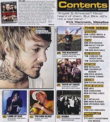
The above contents page is from music magazine Kerrang, the contents page seems to be a very busy page, eye catching, with a lot of images, making it easier for the audience to understand the subheadings by relating to the images. It’s a very explanatory page, due to the amount written as well images. Through the images it is also easy for the audience to understand what sort of music is represented in this magazine which is rock.
The subheadings of the contents page are clear and bold, allowing the consumer to easily recognize the numbers of pages and what they are base on. The colour of the sub headings are black and yellow, allowing it to me more eye catching. The images being on one side and the text being on the other show the simplicity of the contents page. The page numbers are also clearly indicated beside set information, which are also bold, making it easier for the reader to find certain features.
For a magazine representing rock there is not much stereotypical rock represented within it, showing that it can lose its audience, due to there being many bold images, there is not much attention given to the text, which indicate what features are held within the magazine. Whereas as the images is able to lose audience. The images give less information to the consumer.
The contents page is very useful within the magazine due to it having extra information about the editor as well as using images to indicate on certain artist, attracting different types of audiences. Despite it being a bright a page there is yet a limited amount of colour being used thought out the contents page, keeping it a bit simple and understandable for the readers.
There is also some extra information about the magazine, on the top left hand corner the editorial, which allows the readers to get a better insight on the design of the magazine and other information about the magazine, the style of writing used in the editorial relates to the target audience, allowing the audience have a better view of the magazine.
There is also some extra information about the magazine, on the top left hand corner the editorial, which allows the readers to get a better insight on the design of the magazine and other information about the magazine, the style of writing used in the editorial relates to the target audience, allowing the audience have a better view of the magazine.
No comments:
Post a Comment