Monday 31 January 2011

Analysis contents page 2

This contents page is from music magazine Q, it is simple and straight forward, allowing the consumers to have a clear understanding of it straight away. This magazine holds a few images, which is beneficial for its consumers; at through the image they are able to know what band is mentioned within the magazine, as well having beside the image having a little description on what the article is about. On the contents page the band shown is The Courteeners, through mise-en-scen we can see that they are dressed causally as stereotypically boys do, relating to the audience through mise-en-scene. The band members are also directly addressing to the readers.
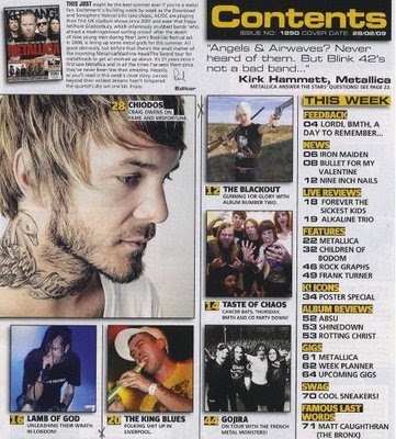
The colours within the contents page are not too bright, yet attract the audience, due to it not being so busy. The layout of the contents page is straight forward as well, having placed the images on one side and text on the other. Despite the image, there is some extra information about a band, below features, “oasis special” Which is not as bright as the other headings, so less attention is drawn to it, and more attention drawn to other factors, but due to it having a large amount of space on the band, it shows what the main article will be within the magazine.
The numbers of each pages stand out as they are big and in a bright colour, the subheadings are also bold, and underneath them there is a sneak peek of what is within a specific article, allowing this to draw the readers into buying it. Due the subheading having a bright red background within them, it makes it easier for the consumer to find what they are looking for if it is “features or every month”, showing it holds many different types of information within the magazine.
The contents page is very useful, in many ways, not only because it give extra information about the article, due to the review at the bottom right, which makes it easier for the person who read the magazine to access what they would like to get from the magazine. Having clear information held within it. This contents page doesn’t only attract attention to a specific thing the attention is drawn through out the page, due there being bold headings and images, as well extra boxes giving extras to the consumers.
Some of the stories, below the sub headings allow the readers to know what the magazine will hold within it, the contents allow the audience to easily skip to what they would like to read rather then going through the whole magazine as a lot of contents pages give a limited amount of information on the contents page. This also allows the magazine look more professional, as there is a straight forward layout.

Sunday 30 January 2011

Analysis contents page 1


The above contents page is from music magazine Kerrang, the contents page seems to be a very busy page, eye catching, with a lot of images, making it easier for the audience to understand the subheadings by relating to the images.  It’s a very explanatory page, due to the amount written as well images. Through the images it is also easy for the audience to understand what sort of music is represented in this magazine which is rock.
The subheadings of the contents page are clear and bold, allowing the consumer to easily recognize the numbers of pages and what they are base on. The colour of the sub headings are black and yellow, allowing it to me more eye catching. The images being on one side and the text being on the other show the simplicity of the contents page.  The page numbers are also clearly indicated beside set information, which are also bold, making it easier for the reader to find certain features.
For a magazine representing rock there is not much stereotypical rock represented within it, showing that it can lose its audience, due to there being many bold images, there is not much attention given to the text, which indicate what features are held within the magazine. Whereas as the images is able to lose audience. The images give less information to the consumer.
The contents page is very useful within the magazine due to it having extra information about the editor as well as using images to indicate on certain artist, attracting different types of audiences.  Despite it being a bright a page there is yet a limited amount of colour being used thought out the contents page, keeping it a bit simple and understandable for the readers.
There is also some extra information about the magazine, on the top left hand corner the editorial, which allows the readers to get a better insight on the design of the magazine and other information about the magazine, the style of writing used in the editorial relates to the target audience, allowing the audience have a better view of the magazine.

Analysis cover 3


Blender magazine magazine which focuses on a variety of genres, in this cover it is representing pop as well as hip hop as it shows on the front cover, “POP’S BI-CURIOUS BABE” The magazine name is the most effective view upon the front cover due to it being very bold.
Once again this cover suggests simplicity, through the calm white background, as well as the sub headings not being so bold and effective. Pink is a stereotypical colour for girls showing that the audience of this cover is mainly females, around the age of 16-25. From the heading "free downloads!" it also shows that the audience they are trying to attract are younger audiences, as the younger generation tend to consume music through downloads.
 There is a limited amount of colors used, black, pink and white. Having a limited amount of colors has a better effect upon the readers as well as the magazine, due to it looking more professional, as well as it being clear for the readers.
Due to the lack of colours the cover yet has a lot of attention drawn towards it due to the emphasis of the heading through capital letters. Attracting its audience, and easily getting a glance of what the magazine holds.
The main image on the front cover is of Katy Perry, pop icon. Through mise-en-scene we can see that the way in which Katy Perry is dressed is how pop icons as well as hip hop, tend to dress. From the clothing it also may attract male, as the way she is dressed is reveling attracting male readers wanting to read on, due to her look. From the cover we are also able to see the different topics involved within the magazine as well various artists such as T-Pain and there view upon things, allowing this to be way in which Blender is able to attract there consumers. The cover also shows that it has various different songs within the magazine which consumers may enjoy, gaining more audiences.
The cover of this music magazine is very simple despite it having a limited amount of information about the inside of the magazine, it is yet very bold and eye catching, due the main image of Katy Perry having direct eye contact with the audience. The scheme of using less colours works well as well, it having less happening on the cover allows the audience to understand what will be held within the magazine in more clear view. 

Analysis cover 2


Hip-hop collection is a hip-hop magazine. Attracting both male and female audiences between the ages of 15-25. The heading of the magazine is very eye catching, due to its colour as well as the size of the font, all the subheadings on the front cover, are bright, allowing it to be eye catching attracting the audience straight away. Having a limited amount of colors is a benefit as it shows neatness and attracts audience.
 The main picture on the cover is an Image of Jay-Z, the image of him is suggesting a serious feeling, as well as wealth as the artist is wearing a ring and chain which is shown as a stereotypical view of an hip-hop artists, the image has direct contact with the audience, which is a typical feature in music magazines. Due to the seriousness, it is showing the sort of audience that the magazine is trying to gain. The idea of the artist wearing a cap is also a typical convention within hip hop magazines.
 Sub headings also show that the magazine about Jay-Z as it says “Jay-Z HE’S BACK!”  Showing that it may be an interview of him.
The main offer to the readers is a free CD, the magazine also holds a free CD within it, which is shown from the front cover, as the audience within the age category prefer such freebies."Free CD" written in the top left corner as it based upon a white background, quickly catching the readers attention, as well having extra information about other artist. "50 NEW YORK ANTHEMS!", is also another feature in the magazine which is bold and stands out, just the way the free CD does. Having this feature also shows that it will attract readers who prefer the type of music.
The front cover does not subvert typical conventions, as it is straight forward and connoting what it should be. The cover allows us to see who the audience are, and how it attracts its audience, through the image which is portrayed by the artist on the cover, as well the bright colors use. Conventions used in this cover would be the idea having the artist in front of the title, which is a very popular convention in music magazines, as well as a bar code, as previously mentioned the ring,chain and cap worn by the artist all are typical conventions of a hip hop magazine.

Analysis cover 1


 From the front cover of the magazine you can see that the target audience for this magazine would attract both males and females around the age of 16-25. The first thing that attracts the readers eyes as they see the cover would be the medium shot of the artist Taylor swift an pop artist also knows as an hip hop artist, she has direct contact with the readers, engaging the audience. The title is placed behind the artist which is a typical convention within many music magazines, allowing audiences to focus on only the artist. The artist is dressed simply, following the the color scheme of the cover. As well as having a limited amount of jewelery, conveying simplicity as the cover is simple and straight forward, there is not much going on within the cover as shown from the artist as well as colors.
 There is a moderate amount of sell lines showing who it is targeting such as “boyfriend trashing radio ruling” yet showing a clear understanding of what the has within it, as well as showing that is aimed towards teenagers. Despite some appealing to females, there is some that appeal to both such as "194 Downloads" this tends to relate to a younger audience as they tend to consume there music through downloads. Through some sell lines it shows that the magazine is not only aimed at younger readers as well as those who are into Hip hop. "Plus Cnarls Barkly, Nirvana, Michael Jackson" From Nirvana we can see that it can also attract older readers as well as younger ones as shown from the image of Taylor swift, who appeals more to younger readers. From the many different types of artist mentioned in the mentioned in the magazine we can that the Blender magazine is representing a wide range of genres such as pop, hip hop, rock and and RnB.
 The layout of the front cover is simple with no much color within it, colors that are used are blue black and grey which tend to be seen as dull colors ,despite this the colors do stand out, font is also very limited, having less going on allows the readers to understand it.
The black box adds an extra image to the cover, which is more appealing, and allows some of the main features to stand out, the color of the box attracts audiences attention straight away as there is not many such conventions on the magazine.There is many typical conventions on the magazine such as bar code, mass heads also colloquialism "D'OH!"
Blender magazine was previously published by Dennis publishing, but now is published by  Alpha productions.